WÓJCIK DESIGN, as befits a design company, knows how to design a logotype that will support the brand (identifies the brand). It could be a trivial matter – just a picture with a good look on company paper, stamp, label. Nothing but very much depends on it.
What really determines whether the logo is successful?
What are the key features for a successful logo?
Nice colors, sophisticated effects? Of course they are not!
The logo is to be easily memorized and carry a positive message, it can only be achieved by taking into account the following features:
SIMPLICITY
Simplicity – the simpler the picture, the easier it is to remember it, so it is effective.
Simple logo design makes it work better on small sizes: business cards, letterheads, details do not blur. A simple logo is faster recognizable by recipients – a legible logo using simple printed letters.
Anything that causes controversy or can offend someone will only hinder the creation of identity and ultimately hurt the reputation of the brand.
TIMELESSNESS
The logo must be timeless – in this way it will not look old-fashioned in a while.
The logo must be based on simplicity and contours in a pure form that will have a lasting effect on the minds of the recipients. The timeless style of illustration makes the identity not susceptible to overdue.
VERSATILITY
The logo can be used on every medium – screen / print, small / large – and is legible.
MESSAGE
The logo can not tell the whole story of the brand – it’s too much information in a single image. However, it can be a starting point to attract audiences and present them with a message. The logo does not have to tell everything exactly, not literally, but maybe in an abstract way. Subliminal is to reflect the brand’s message in the logo
BRAND IMAGE
The logo can not achieve everything, but it can be the basis for brand identity and should support it. The style of the logo must be consistent with the image of the brand as a whole, so as not to create two different messages. The main purpose of the logo is to identify the company’s visual identity visual identity. If the company logo looks the same as the logo of another company, it is unsuccessful.
Copying someone else’s work (plagiarism) is never beneficial.
When you take all the features listed above, you can start creating a logo. After the initial sketches (visualized ideas), which are the stages we choose the best, the most interesting and the simplest.
![]()
![]()
![]()
Usually, there are several versions to choose from – in different variants of the logotype and at least one version in the negative. It is important to justify the choice taking into account: simplicity, timelessness, versatility, message and image both in the proposed icons and using the simplest fonts.


The logo is supposed to give a sense of confidence and effectiveness, it is to inspire trust and provide a solid basis for action. The logo can not be frivolous, it can not evoke extreme feelings. The logo should be the simplest to be memorized.The logo propositions are enclosed in an easy shape adapted to both
stamps, business cards, leaflets or letterheads. You can both use the whole logo as well as only icons without a logo, depending on the needs.
![]()
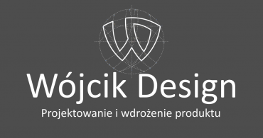
The WÓJCIK DESIGN logo, as seen above, fulfills all basic features. The icon refers to the design that the company deals with. Stylized letters W and D inscribed in a circle symbolizing the world, are in themselves a project related to engineering calculations and the first letters of the name: W-WÓJCIK and D-DESIGN. It is simple and easy to remember. It is stable and inspiring. He’s professional and he’s talking about it. The logotype contains the name (and the used fonts inform about the fact that art, vision and fantasy is not foreign) and a brief information about what the company does – in the very core. The whole is clear and timeless, it carries a message and is unique. It looks good in every size as well as on a uniformly colored background.
![]()
When designing a logo, one should also remember about the basic rules of its use because all the elements of the logo constitute its entirety (the brand mark consists of an icon and a logotype). The logotype is not a font based on existing glyphs and should not be played using a font. The icon can be used as a standalone sign if necessary.
The minimum reproduction size for a brand mark is as follows:
45 mm in print or 165 (width) x 105 (height) pixels on the screen.
To protect the brand’s status, it is important that its mark is surrounded by a space with a width corresponding at least to the height of one capital letter from the logo.
To achieve the maximum effect, it is recommended that the brand mark be used on a white background, or on a uniformly colored background.
The brand mark should not be placed near the distracting elements or on the crowded background images.
The logo should be reproduced in the basic version.
Logo elements should not be changed in relation to the guidelines: scale and perspective, color, arrangement.